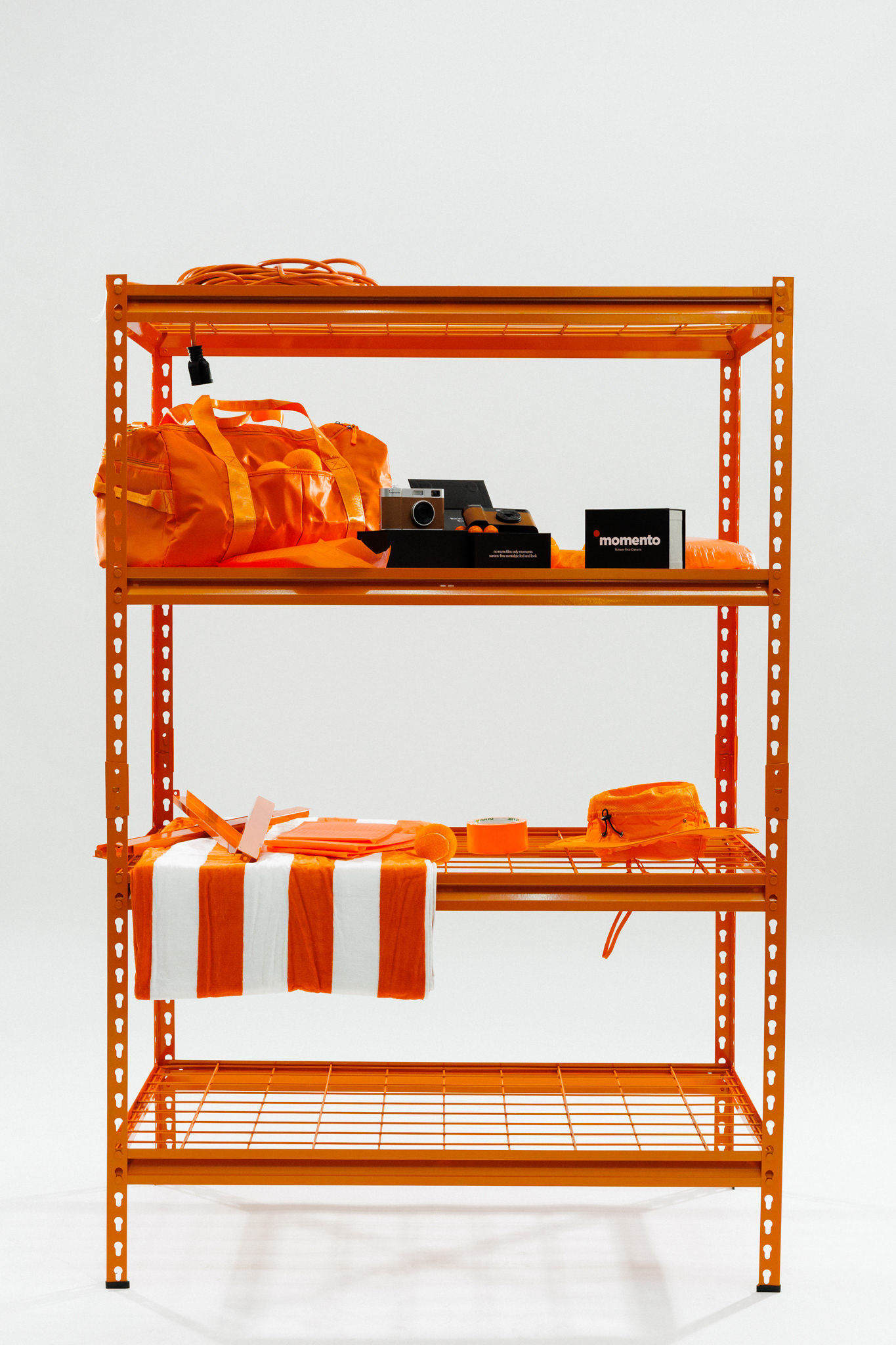
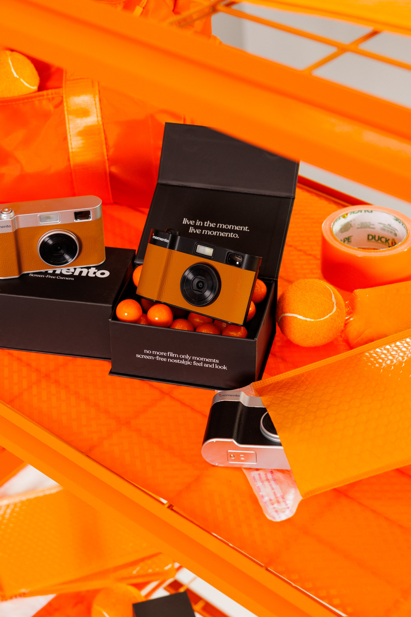
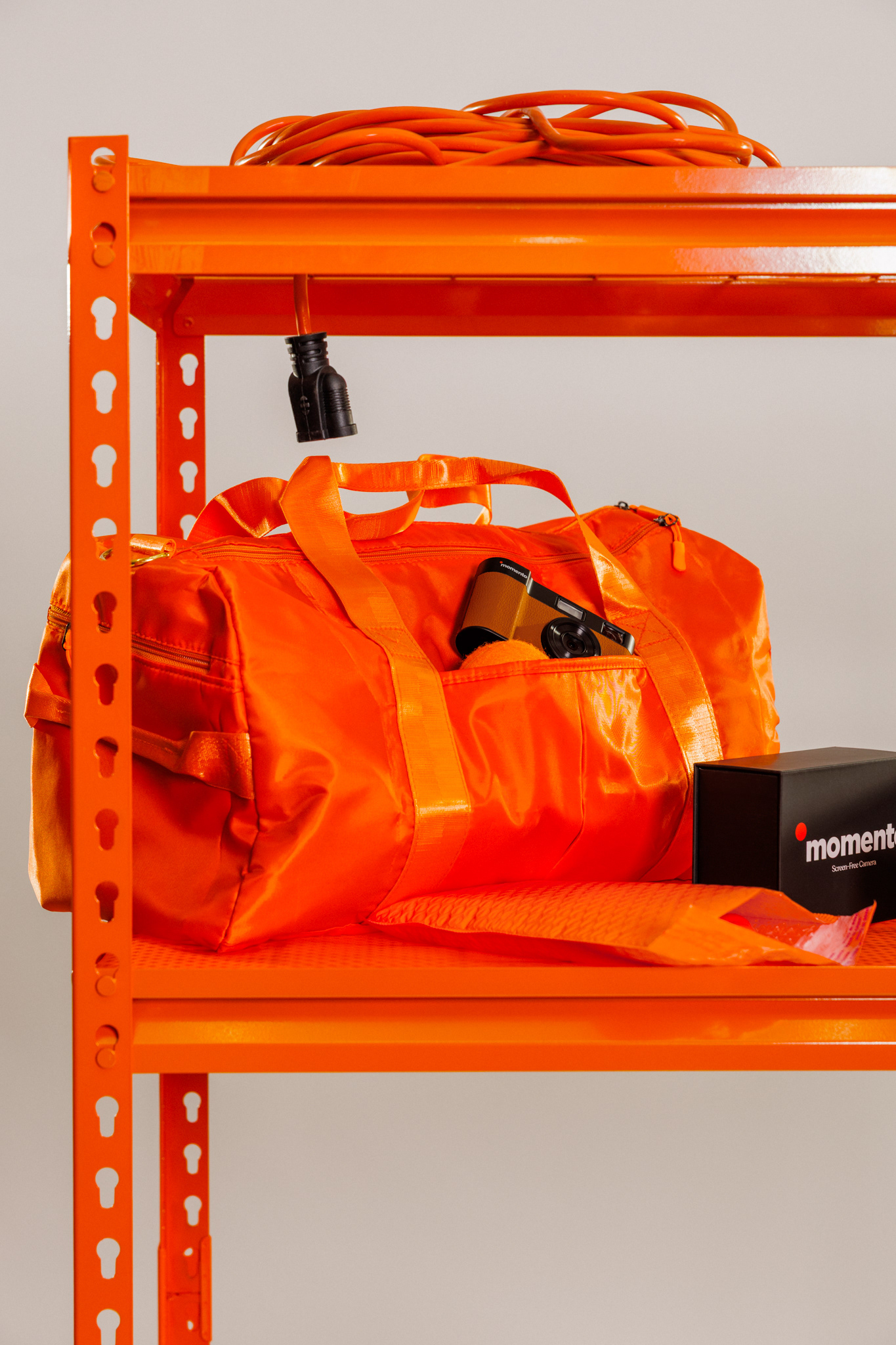
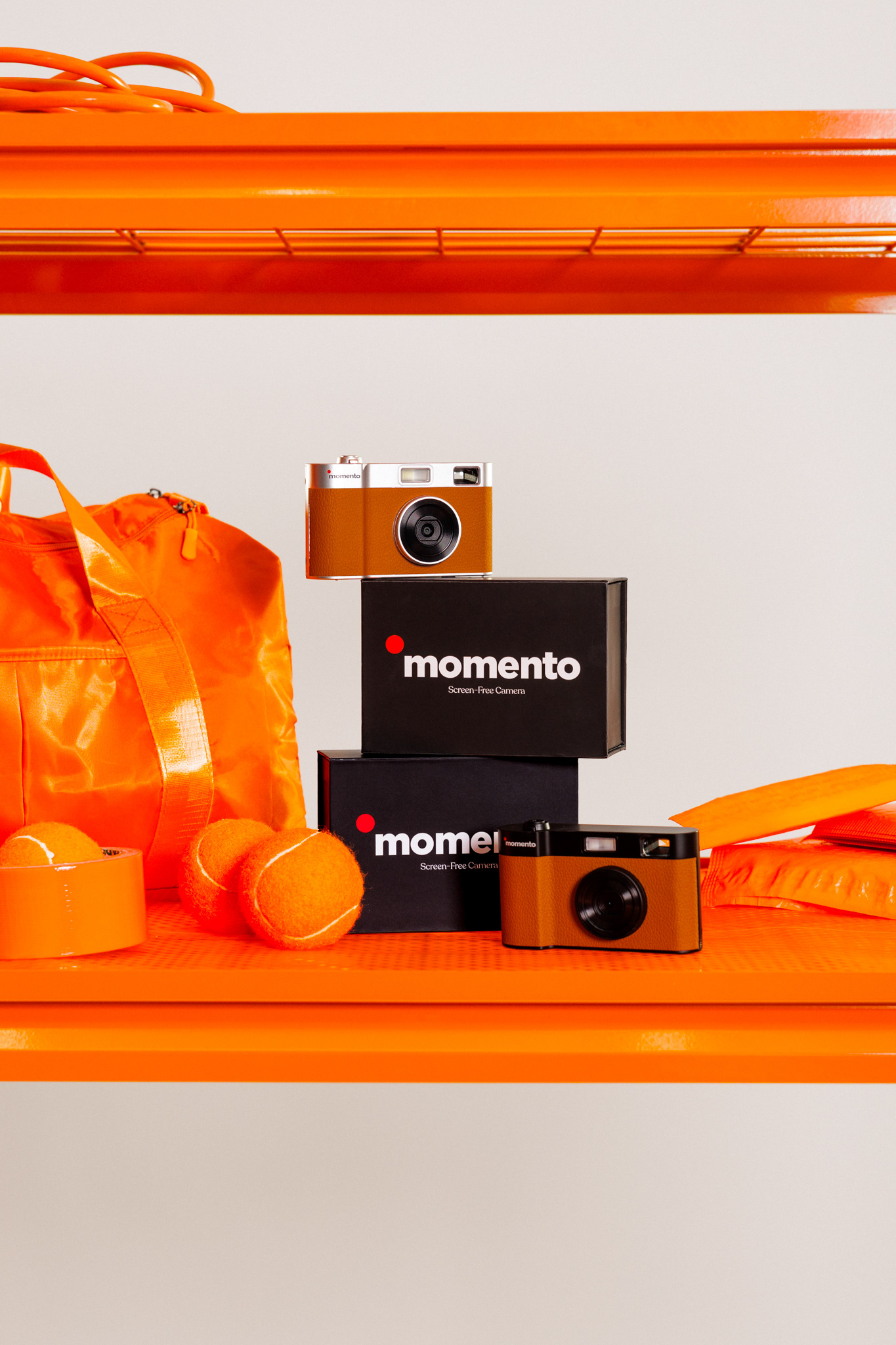
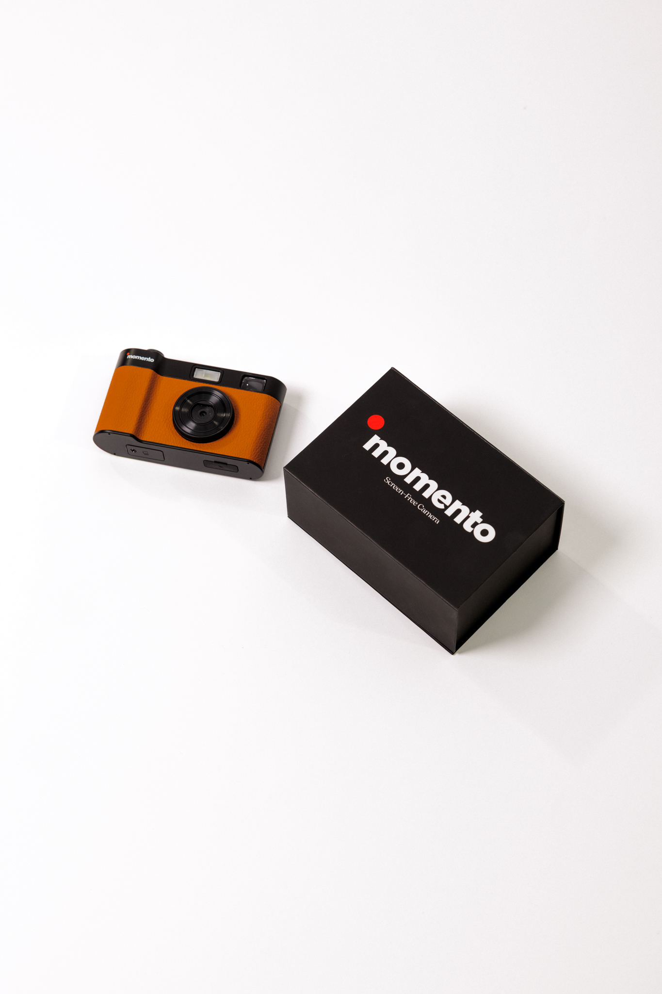
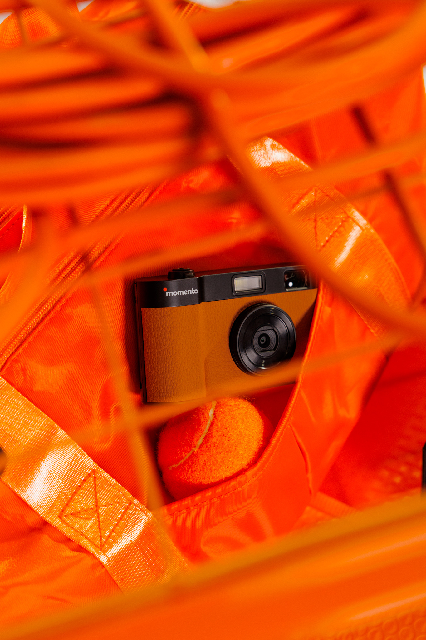
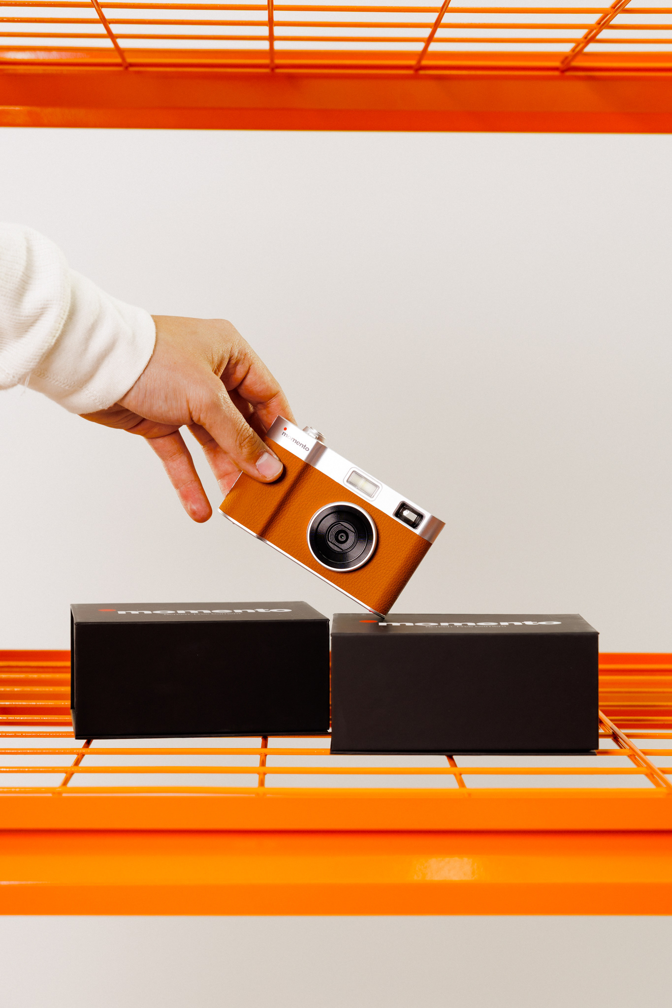
For this [project], my client wanted product shots that weren't so blanddd. My client sent over a few reference images, and that was all I needed to fully visualize the end product. I immediately began sourcing orange props - ensuring these props not only matched in color, but also conveyed the story of the product. The message? This product is portable, fun, and perfect for moments with friends. After a bit of editing and color matching, I was able to really make these images POP.